Graphics
R Foundations Course
November 21, 2022
Overview
Plots in base R
ggplot2
Tables
libraries
Plots in base R
No frills
Base R graphics are useful for quick, exploratory “no-frills” plots.
(For anything better looking or more complex or where you want more control, use ggplot2)
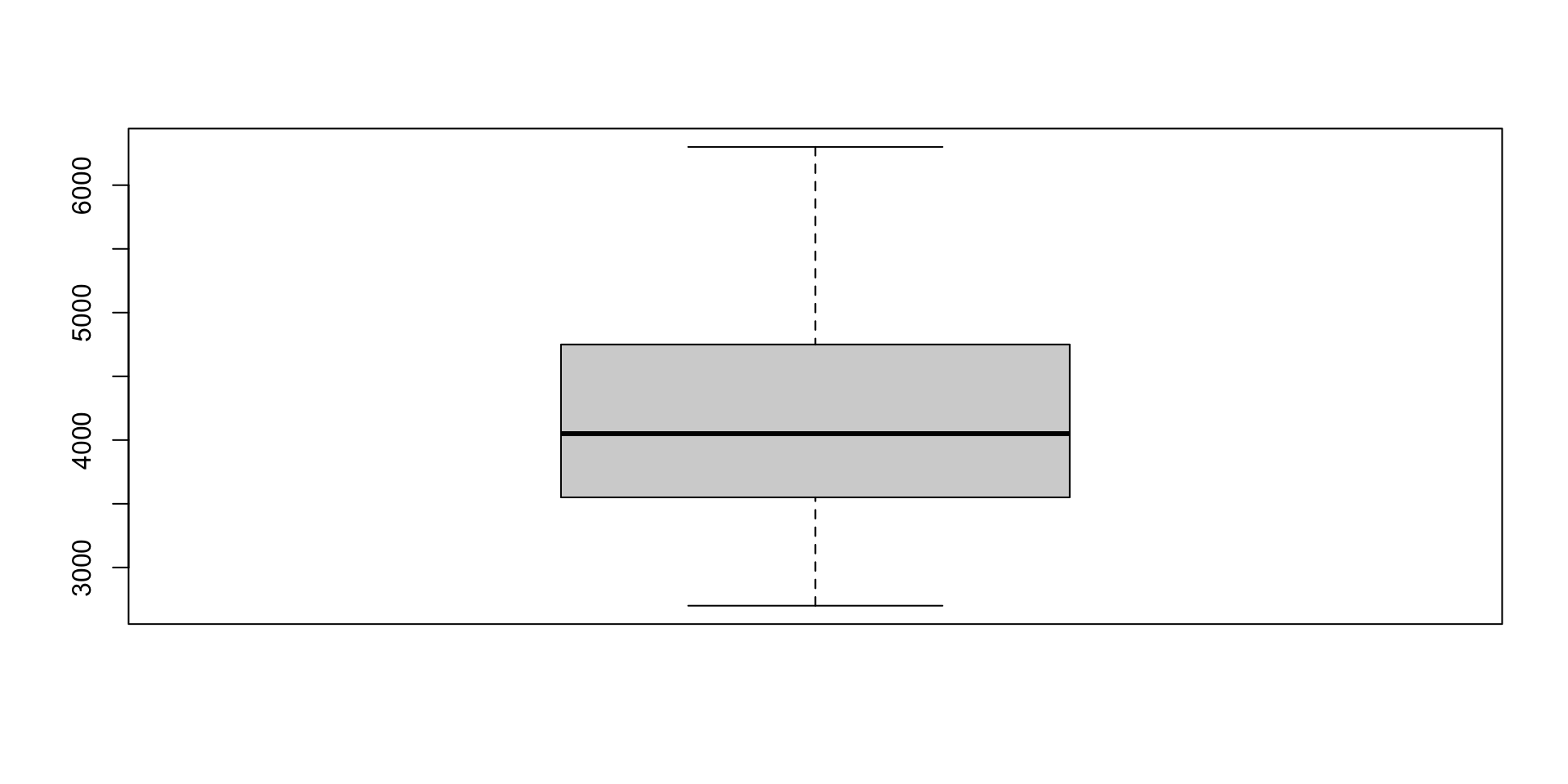
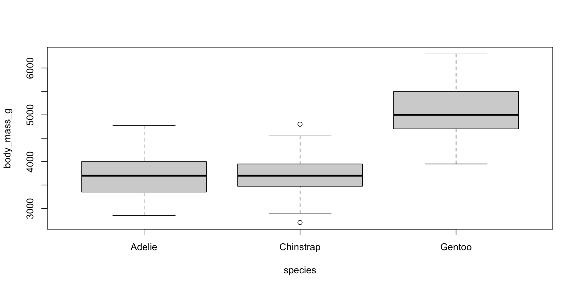
Boxplots
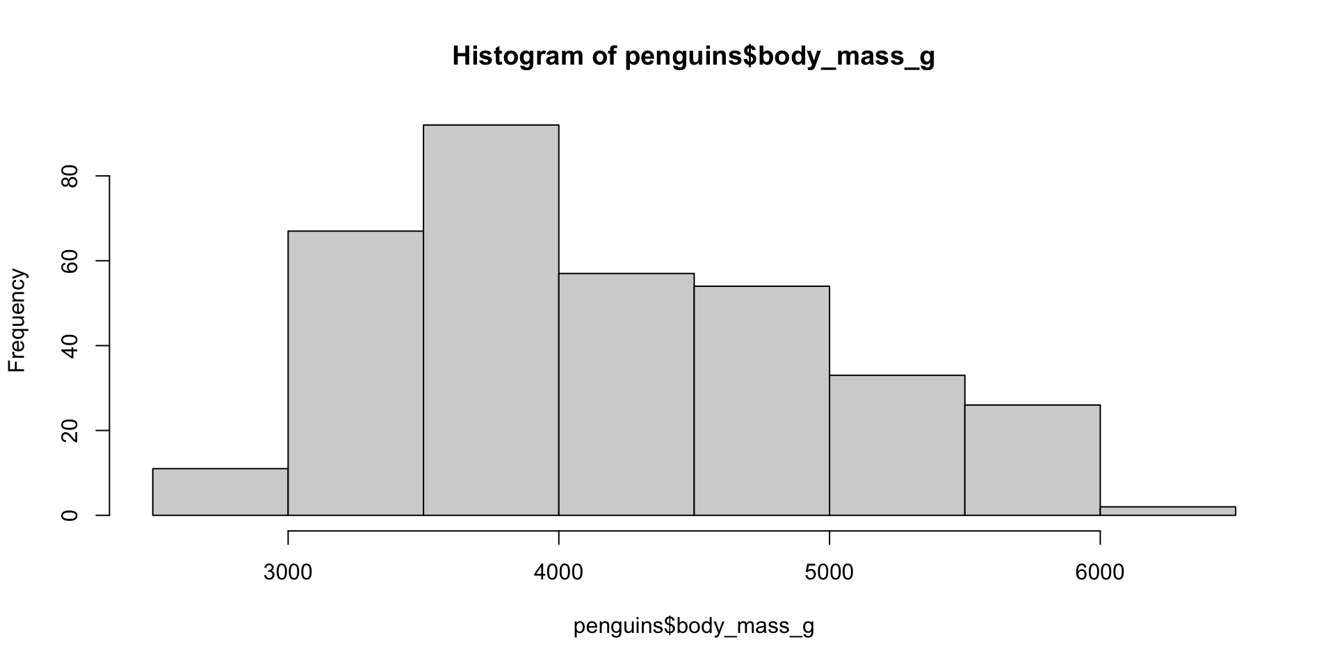
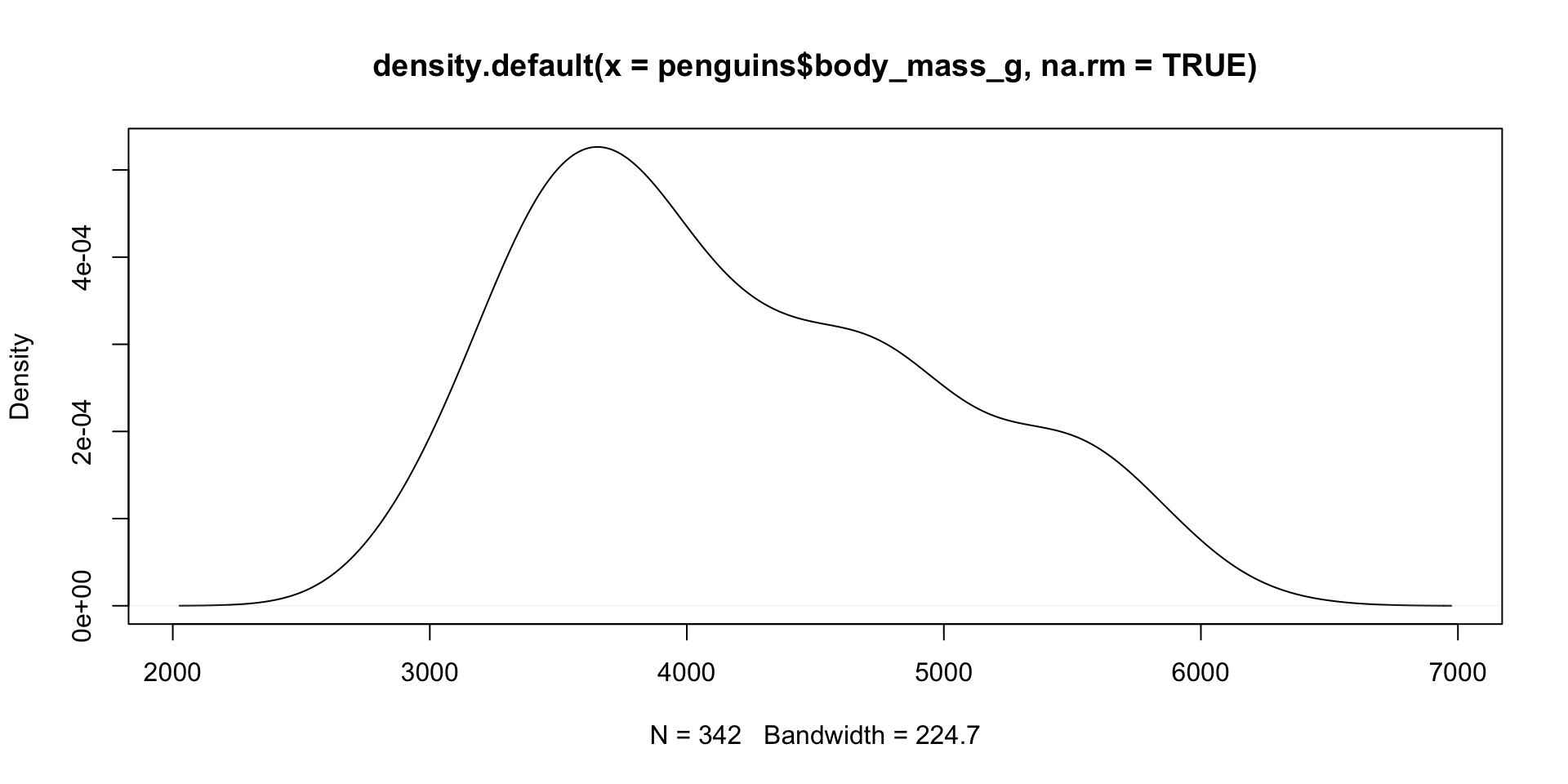
Histogram/Density
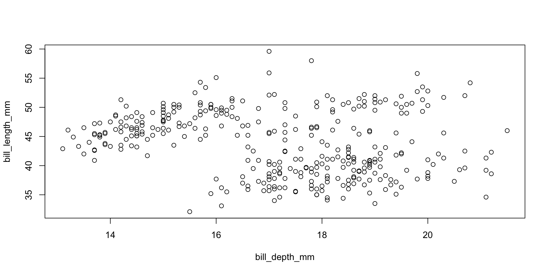
Scatterplots
Plot methods
Many different objects in R have defined plot methods:
 [1] plot,ANY-method     plot,color-method   plot.acf*
 [4] plot.data.frame*    plot.decomposed.ts* plot.default
 [7] plot.dendrogram*    plot.density*       plot.ecdf
[10] plot.factor*        plot.formula*       plot.function
[13] plot.ggplot*        plot.gtable*        plot.hcl_palettes*
[16] plot.hclust*        plot.histogram*     plot.HoltWinters*
[19] plot.isoreg*        plot.lm*            plot.medpolish*
[22] plot.mlm*           plot.ppr*           plot.prcomp*
[25] plot.princomp*      plot.profile.nls*   plot.R6*
[28] plot.raster*        plot.spec*          plot.stepfun
[31] plot.stl*           plot.table*         plot.trans*
[34] plot.ts             plot.tskernel*      plot.TukeyHSD*
see '?methods' for accessing help and source code
e.g. if you call plot on an object of type lm, it will call plot.lm
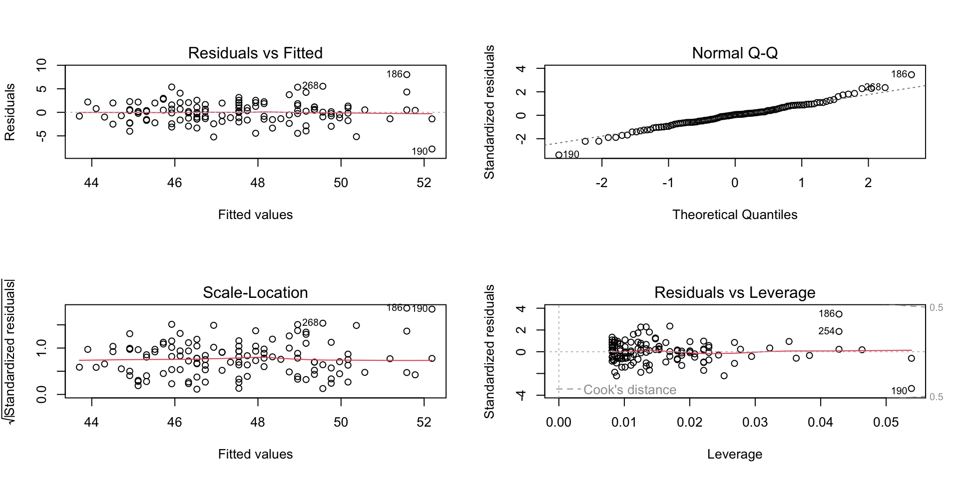
Linear model diagnostic fits
Your turn!
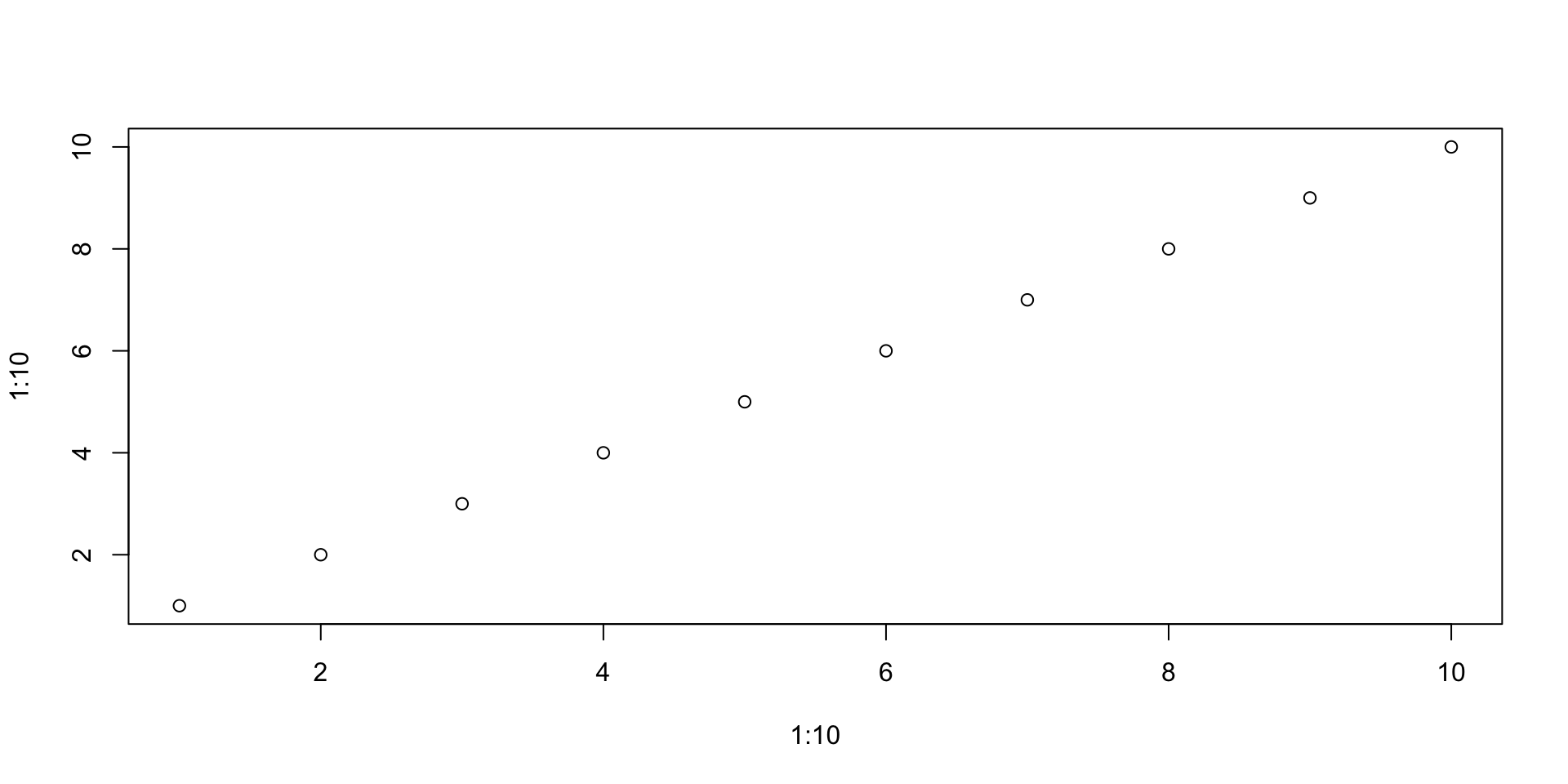
From the starting point of plot(1:10, 1:10), experiment with the arguments type and pch. See ?plot
Can you create a plot with triangular points linked by lines?
Can you do the same with the lines() function? What are the similarities and differences?
ggplot2
Intro to ggplot2
From https://ggplot2.tidyverse.org:
R has several systems for making graphs, but ggplot2 is one of the most elegant and most versatile. ggplot2 implements the grammar of graphics, a coherent system for describing and building graphs. With ggplot2, you can do more faster by learning one system and applying it in many places.
From https://r4ds.had.co.nz/data-visualisation.html:
You provide the data, tell ggplot2 how to map variables to aesthetics, what graphical primitives to use, and it takes care of the details.
ggplot2 usage
ggplot2 is part of the tidyverse.
It has been around for over 10 years and is used by hundreds of thousands of people.
It can take some getting used to, but is worth the investment to learn properly
ggplot2 key components
Every ggplot2 plot has three key components:
Data (typically in a data frame),
A set of aesthetic mappings between variables in the data and visual properties, and
At least one layer which describes how to render each observation. Layers are usually created with a geom function.
Cake!
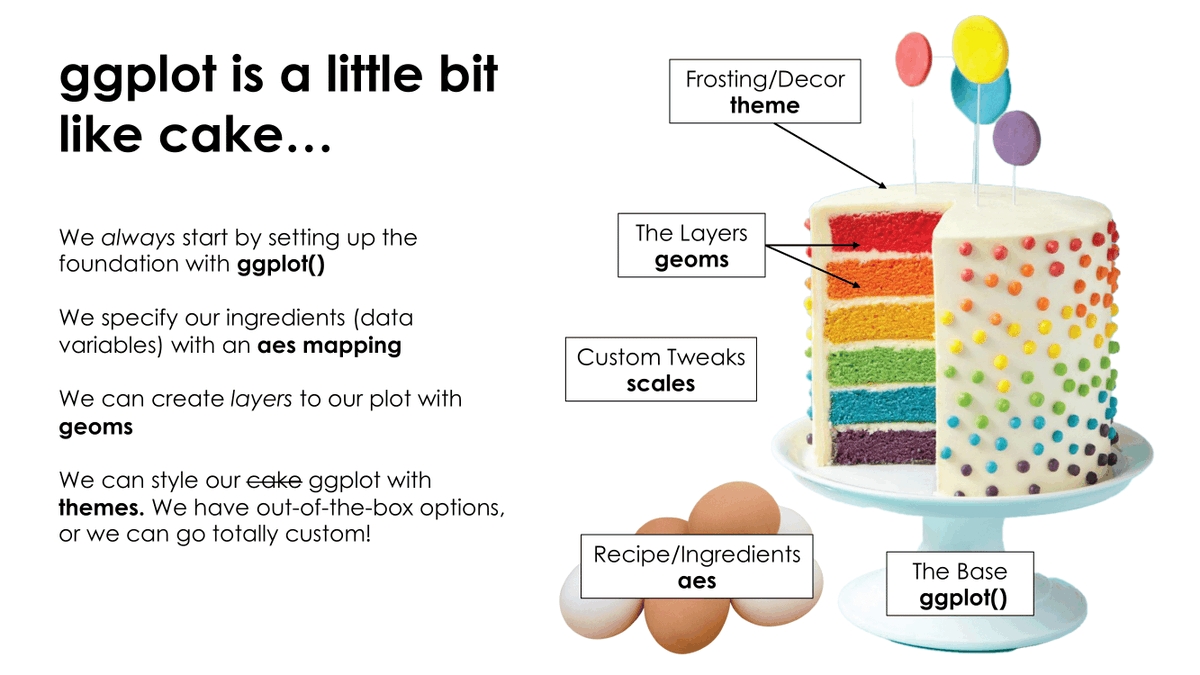
Image credit: Tanya Shapiro
Initiate with data
Package is ggplot2 but function is ggplot()

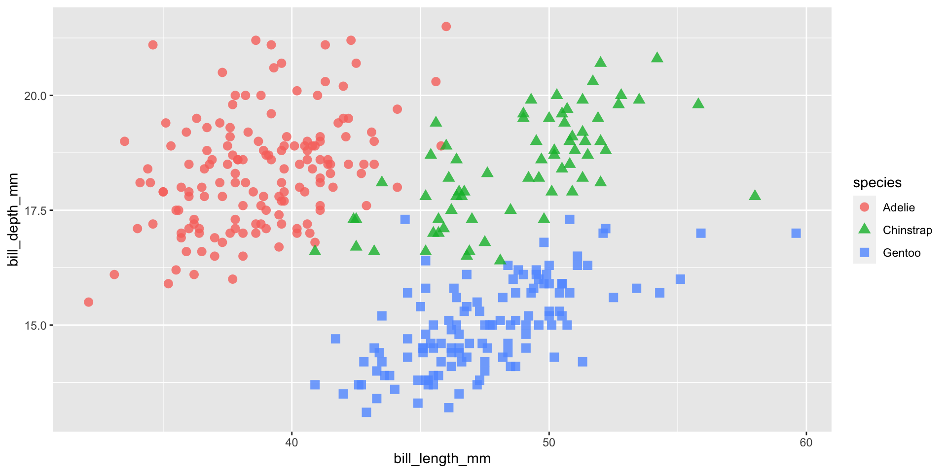
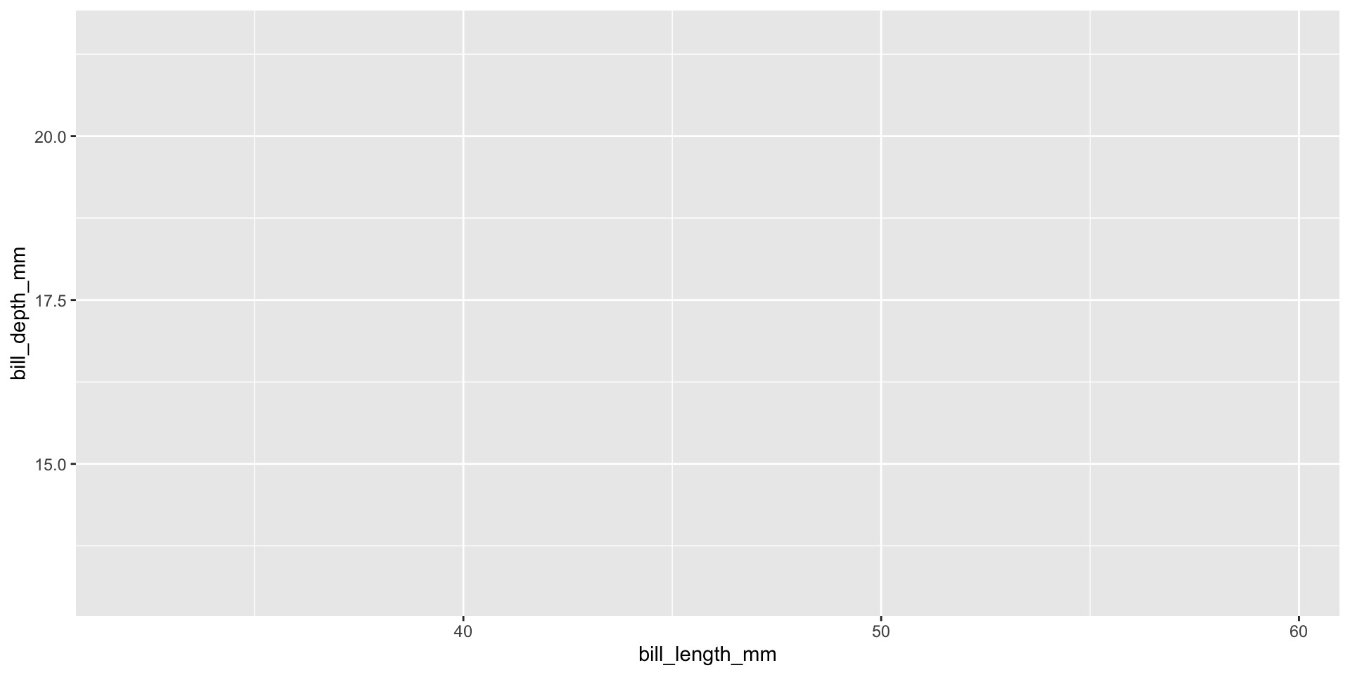
Add aesthetics
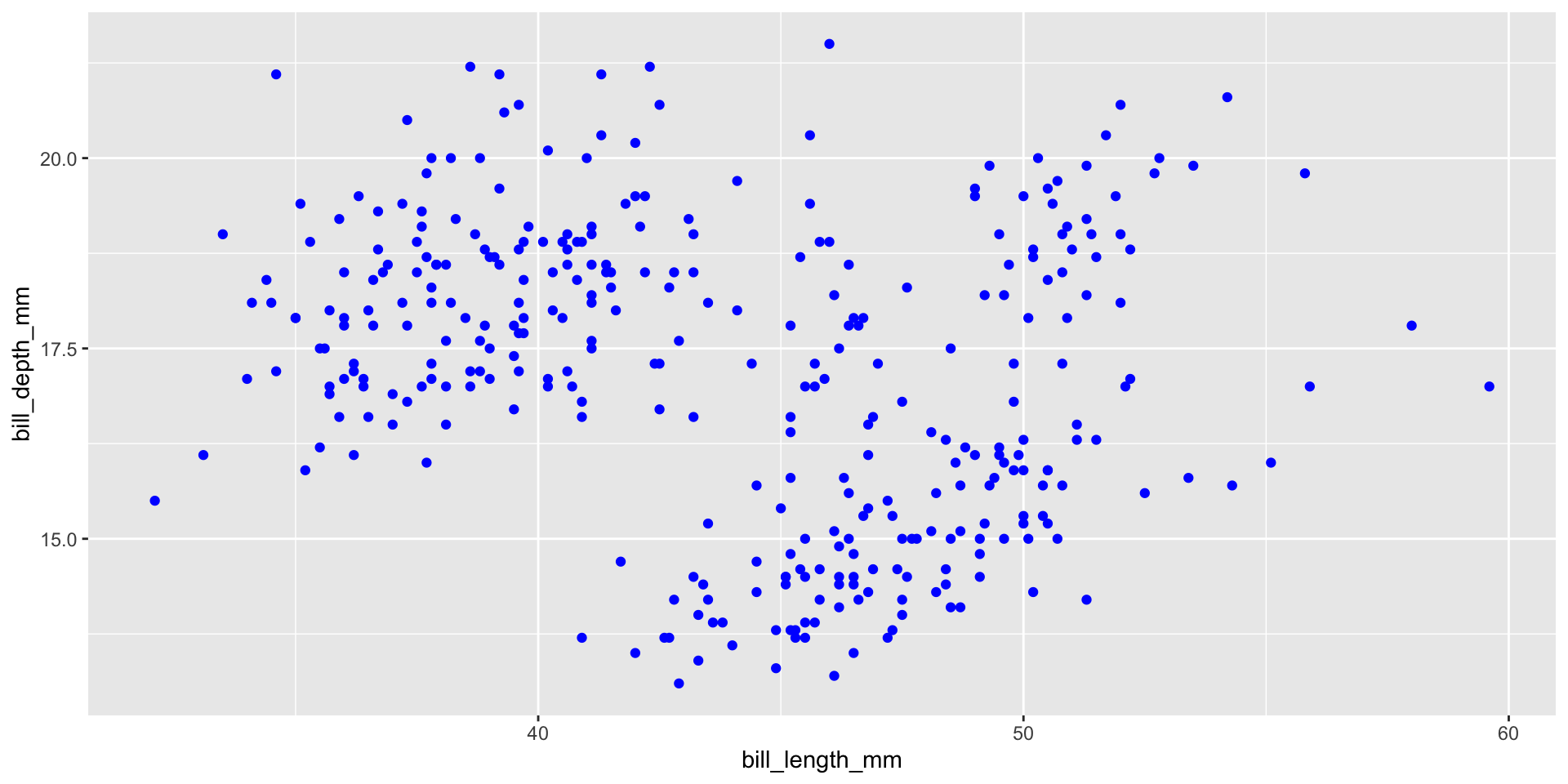
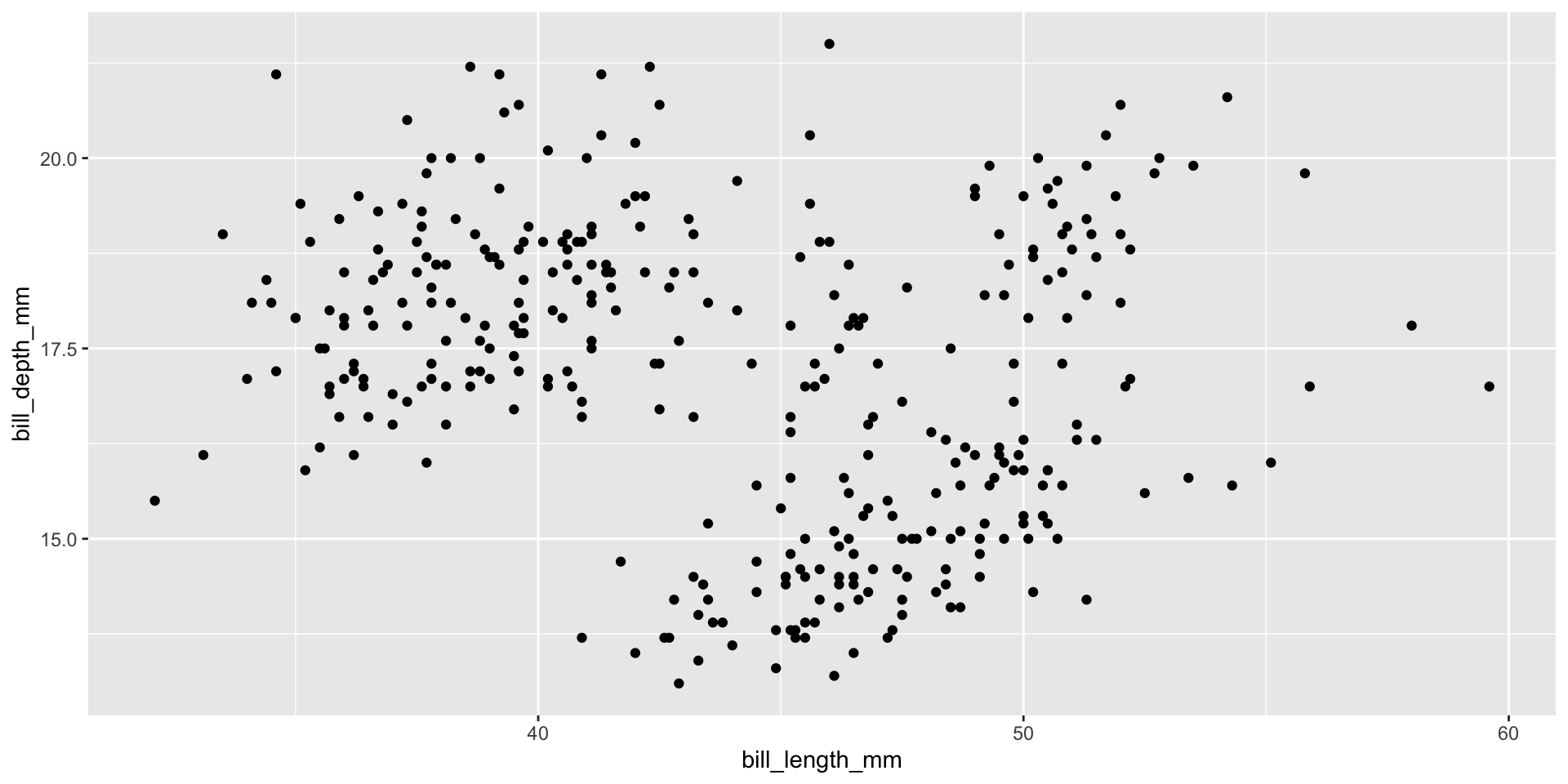
Add points
Layers are added with + (not %>% or |>)
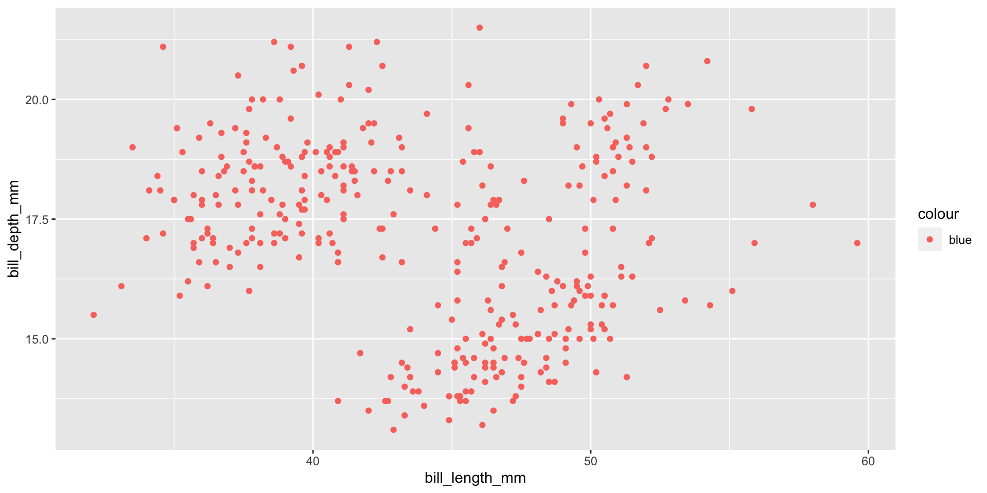
Careful what goes in aes()
When you do want to map a colour to data
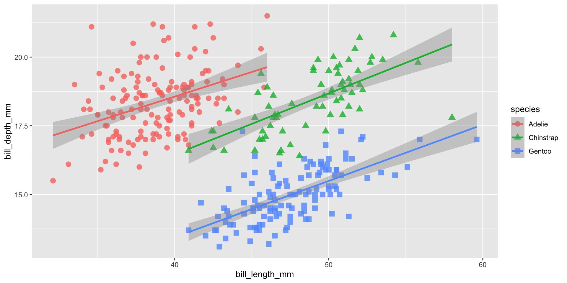
Add additional geoms
Scales in ggplot2
Scales in ggplot2 control the mapping from data to aesthetics. They take your data and turn it into something that you can see, like size, colour, position or shape. They also provide the tools that let you interpret the plot: the axes and legends.
Three groups of scales:
- position scales and axes
- colour scales and legends
- scales for other aesthetics
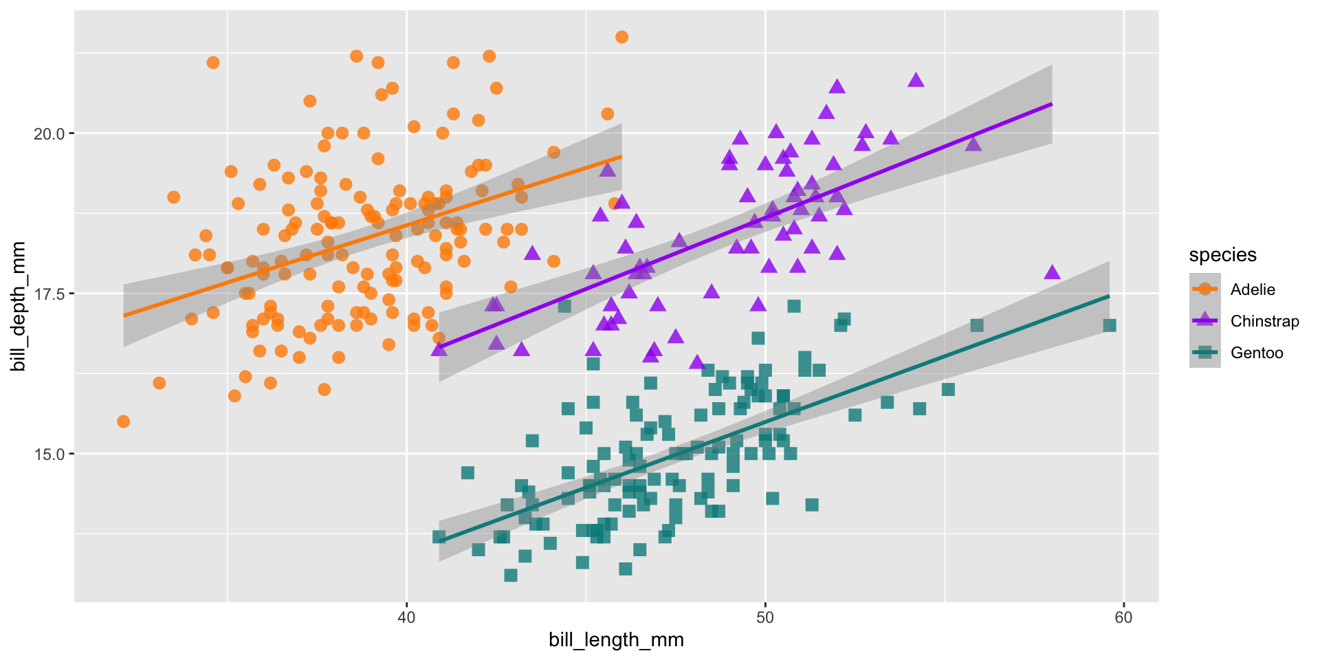
Add a colour scale
Facets
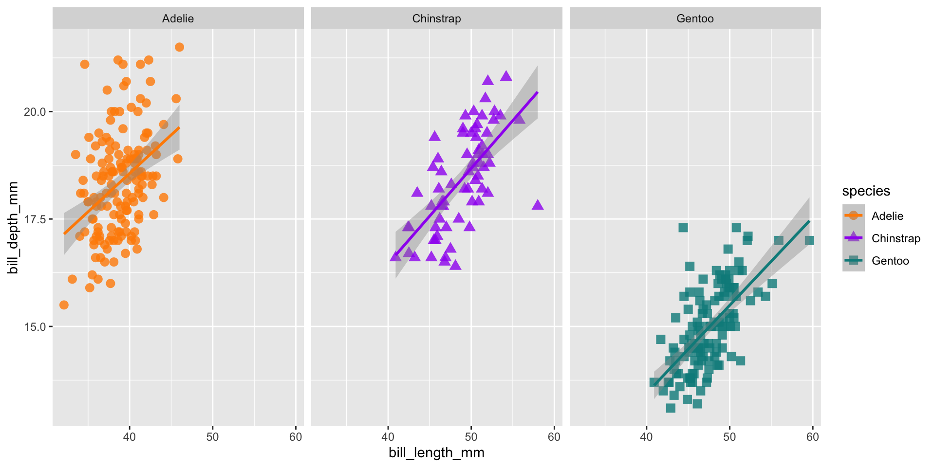
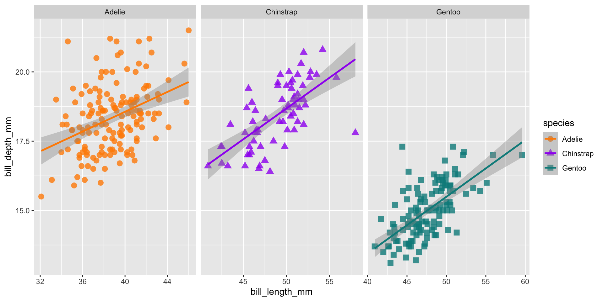
ggplot(data = penguins,
       aes(x = bill_length_mm,
           y = bill_depth_mm,
           group = species)) +
  geom_point(aes(color = species,
                 shape = species),
             size = 3,
alpha = 0.8) +
geom_smooth(method = "lm", aes(color = species)) +
scale_color_manual(values = c("darkorange","purple","cyan4")) +
facet_wrap(~species, scales = "free_x")Add theme elements
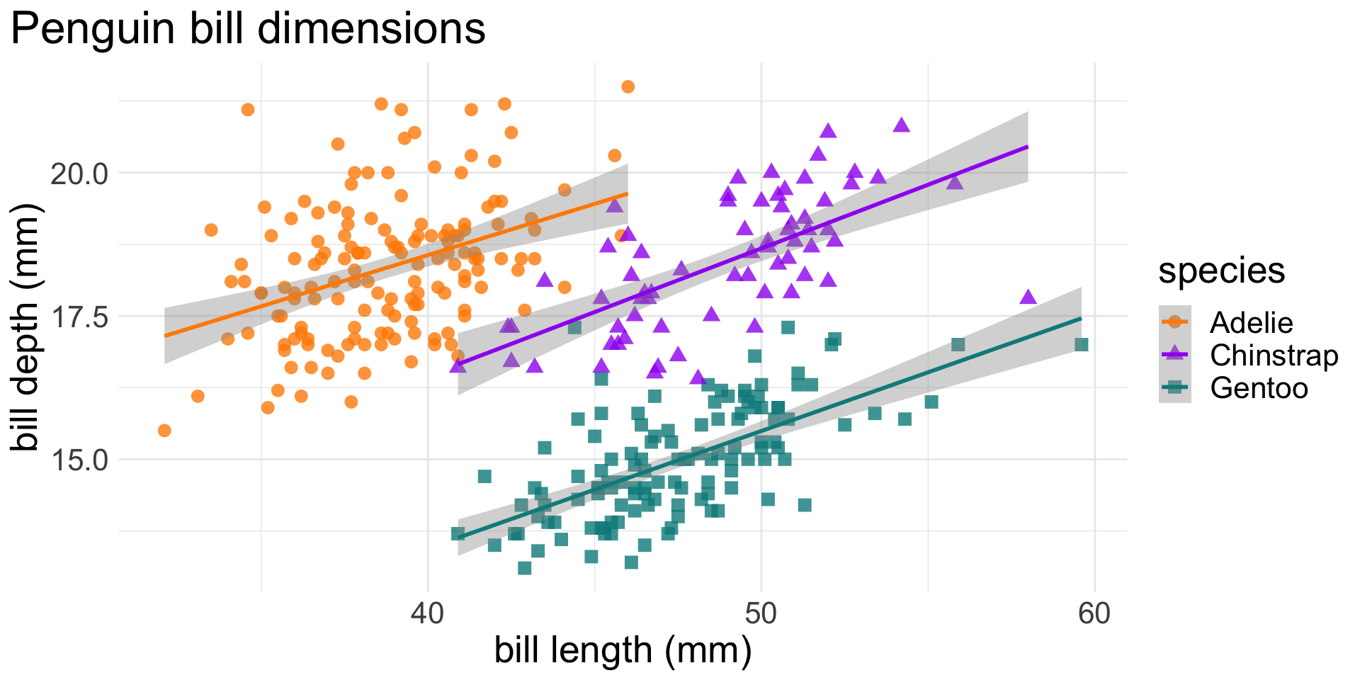
ggplot(data = penguins,
       aes(x = bill_length_mm,
           y = bill_depth_mm,
           group = species)) +
  geom_point(aes(color = species,
                 shape = species),
             size = 3,
             alpha = 0.8) +
geom_smooth(method = "lm", aes(color = species)) +
scale_color_manual(values = c("darkorange","purple","cyan4")) +
labs(title = "Penguin bill dimensions",
x = "bill length (mm)",
y = "bill depth (mm)") +
theme_minimal() +
theme(plot.title.position = "plot",
text = element_text(size = 20))Your turn!
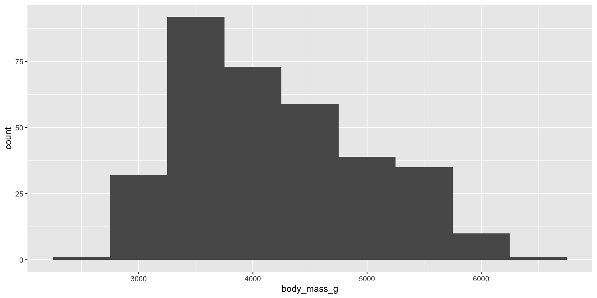
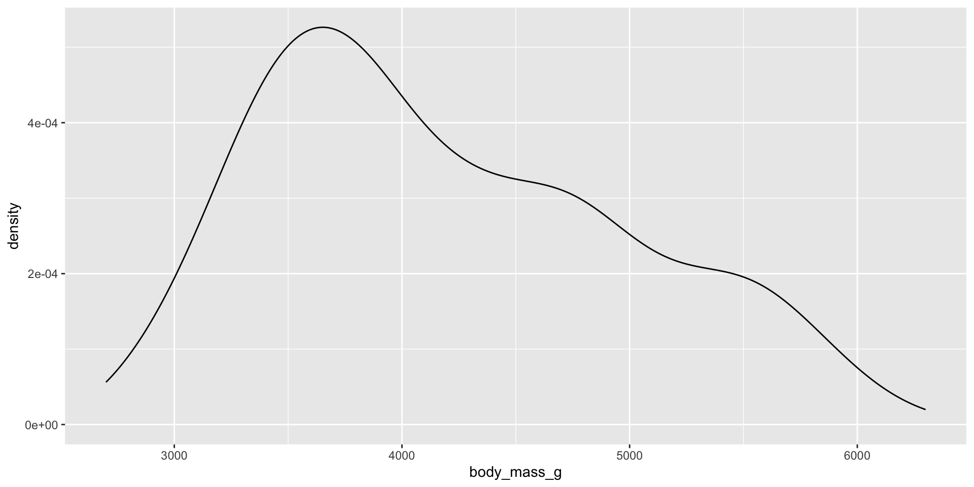
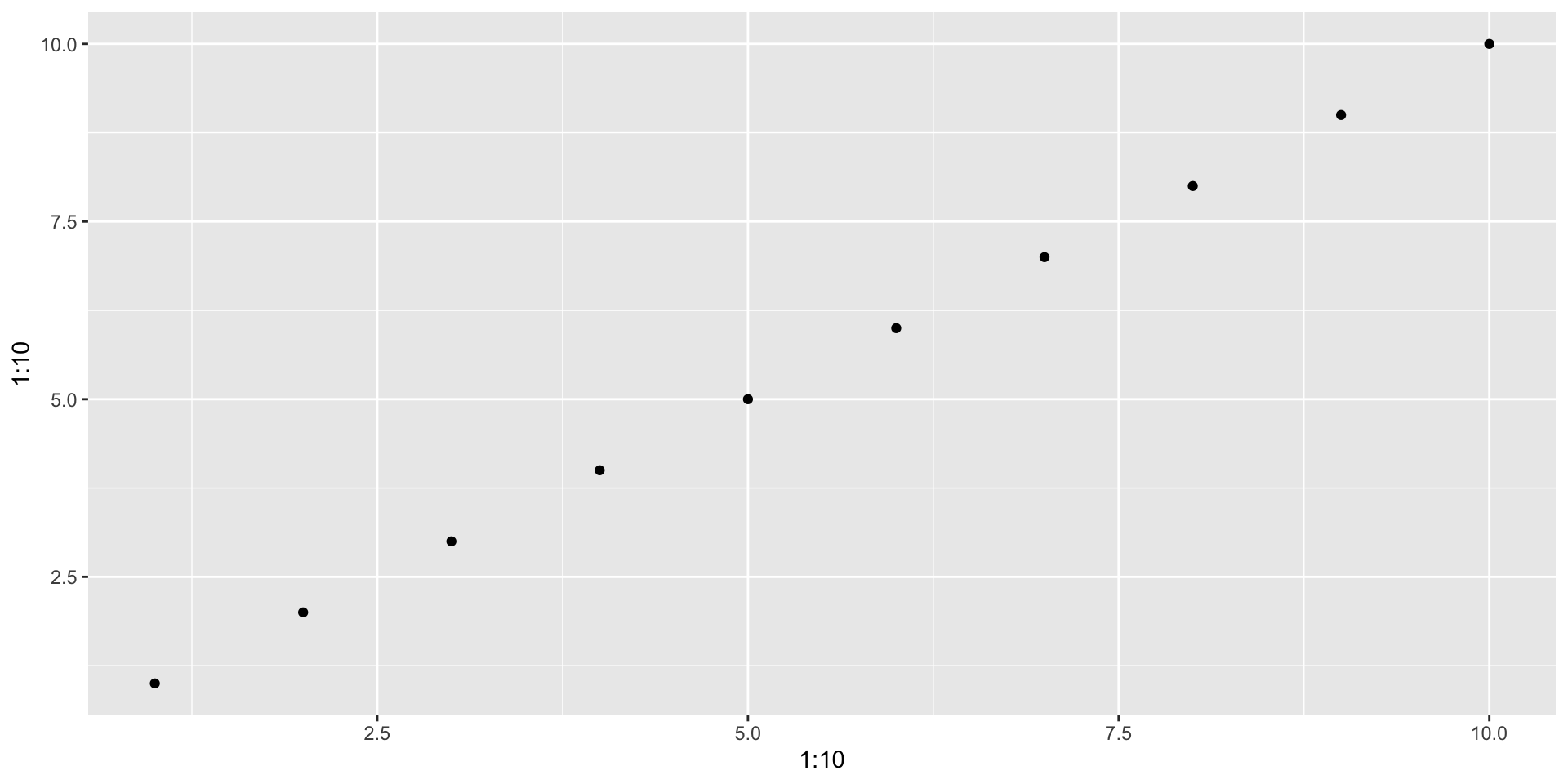
Recreate the base R plots from the first part of this session in ggplot2.
You may find the list of available geoms (and there help pages) useful:
Boxplot 1
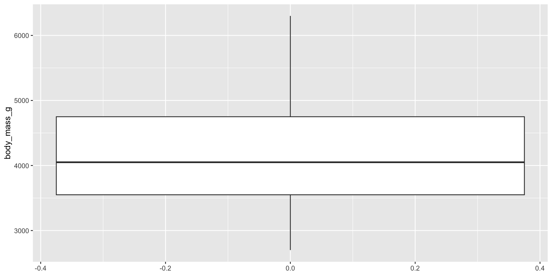
Notes
aes()can be defined for the whole plot or in the geom- first arguments to
aes()arexandy(don’t need to name them if using them in that order)
Boxplot 2
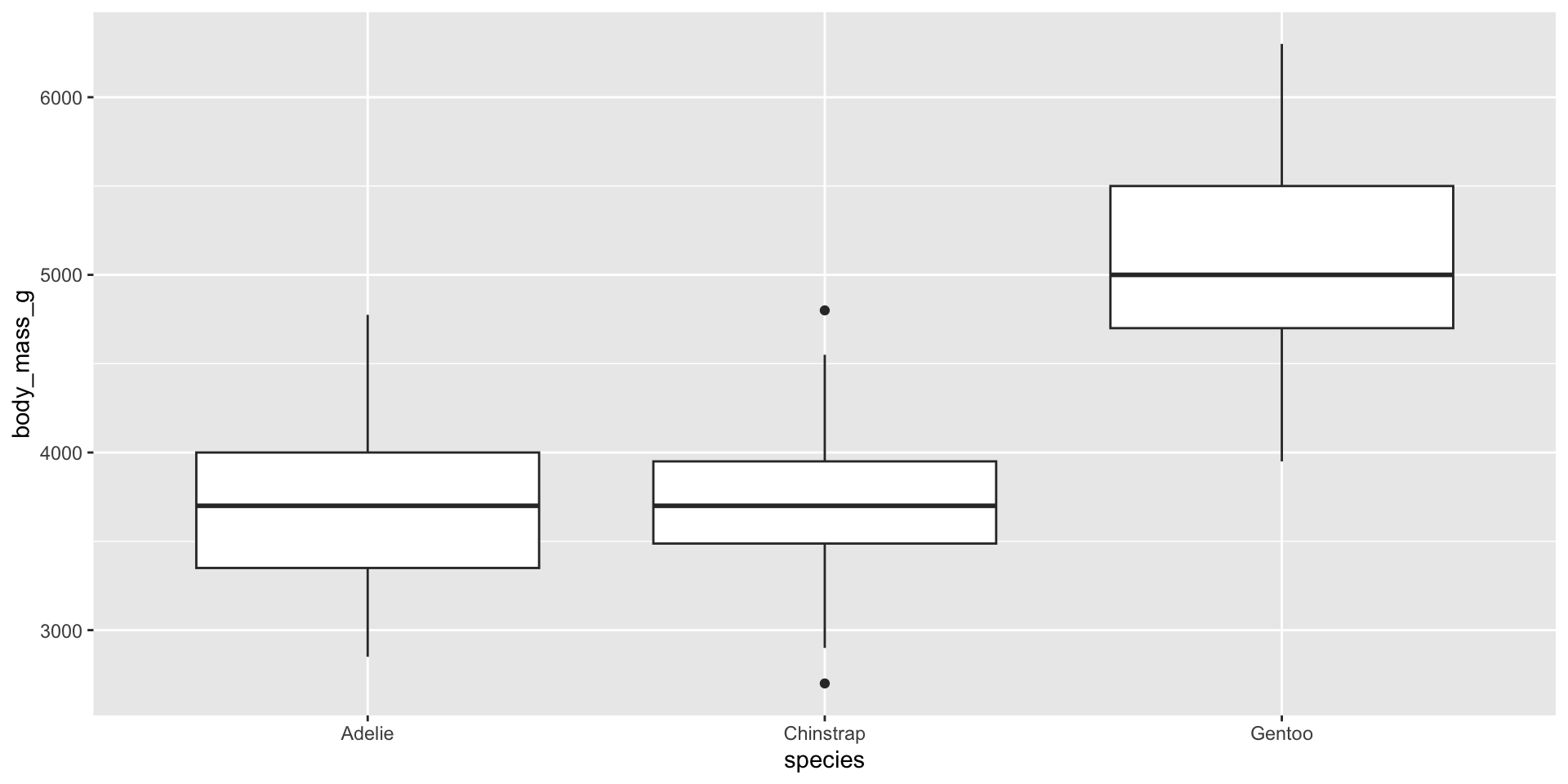
Histogram
Density
Scatterplot with vectors
Extensions
See extensions at https://exts.ggplot2.tidyverse.org/gallery/
Inspiration
R can be used to make incredible data visualisations.
Check out the galleries of these data viz practitioners working with ggplot2:
Also, #TidyTuesday on Twitter or Mastodon is a great source for further inspiration
ggplot2 resources
R for Data Science book: Chapters 3: Data Visualisation and 28: Graphics for Communication, to get up and running quickly
ggplot2 book, for an in-depth understanding
Plotting anything with ggplot2 webinar with Thomas Lin Pederson (one of the main ggplot2 authors)
R graphics cookbook, a practical guide that provides more than 150 recipes to help you generate high-quality graphs quickly
Data visualisation resources
Books about greating good data viz:
Plots in RStudio
Viewing and saving plots in RStudio
In RStudio, graphs are displayed in the Plots window. The plot is sized to fit the window and will be rescaled if the size of the window is changed.
Back and forward arrows allow you to navigate through graphs that have been plotted.
Plots can be saved in various formats using the Export drop down menu, which also has an option to copy to the clipboard.
DEMO
Tables
Getting started with tables
We’re just going to scratch the surface of this today.
We’ll be using the gt and gtsummary packages, but there are many of other.
Here’s a good overview of many different packages.
gt
gt is an R package to create tables. It provides a grammar of tables.
The gt philosophy: we can construct a wide variety of useful tables with a cohesive set of table parts. It all begins with table data (be it a tibble or a data frame). You then decide how to compose your gt table with the elements and formatting you need for the task at hand. Finally, the table is rendered by printing it at the console, including it in an R Markdown document, or exporting to a file using gtsave()
Parts of a gt table
An example
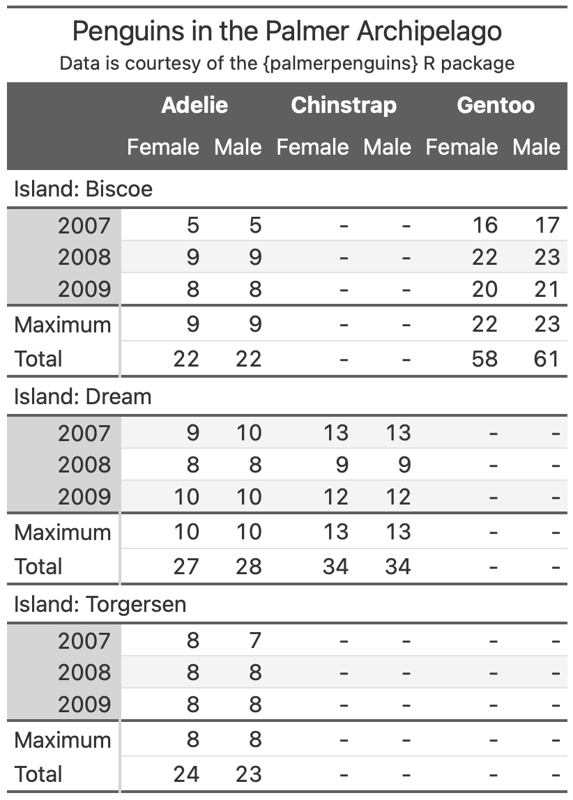
From Albert Rapp’s gt book
Resources
See the article Case Study: gtcars for a thorough example of gt’s capabilities.
See also Albert Rapp’s book on gt.
Guidelines for better tables
Having the technical know-how to code tables is one thing, making them look good and such that the reader can easily read the data is another!
Highly recommend this Tom Mock guide, based on Jon Schwabish’s original. It covers guidelines for making better tables, and shows how to implement them in gt. It demonstrates even more of what gt can do than the article on the previous slide.
gtsummary
gtsummary extends the gt package and is used for summarising tables and working with statistical model summaries.
gtsummary example 1: data
library(gtsummary)
# make dataset with a few variables to summarize
trial2 <- trial %>% select(age, grade, response, trt)

head(trial2)
# A tibble: 6 × 4
age grade response trt
<dbl> <fct> <int> <chr>
1 23 II 0 Drug A
2 9 I 1 Drug B
3 31 II 0 Drug A
4 NA III 1 Drug A
5 51 III 1 Drug A
6 39 I 0 Drug Bgtsummary example 1: code
# summarize and augment the data with our package
summary_table <-
  tbl_summary(
    trial2,
    by = trt, # split table by group
    missing = "no" # don't list missing data separately
  ) %>%
  add_n() %>% # add column with total number of non-missing observations
  add_p() %>% # test for a difference between groups
  modify_header(label = "**Variable**") %>% # update the column header
  bold_labels()
gtsummary example 1: output
| Variable | N | Drug A, N = 981 | Drug B, N = 1021 | p-value2 |
|---|---|---|---|---|
| Age | 189 | 46 (37, 59) | 48 (39, 56) | 0.7 |
| Grade | 200 | 0.9 | ||
| I | 35 (36%) | 33 (32%) | ||
| II | 32 (33%) | 36 (35%) | ||
| III | 31 (32%) | 33 (32%) | ||
| Tumor Response | 193 | 28 (29%) | 33 (34%) | 0.5 |
| 1 Median (IQR); n (%) | ||||
| 2 Wilcoxon rank sum test; Pearson's Chi-squared test | ||||
gtsummary example 2: code
gtsummary example 2: output
| Characteristic | OR1 | 95% CI1 | p-value |
|---|---|---|---|
| Chemotherapy Treatment | |||
| Drug A | — | — | |
| Drug B | 1.13 | 0.60, 2.13 | 0.7 |
| Age | 1.02 | 1.00, 1.04 | 0.10 |
| Grade | |||
| I | — | — | |
| II | 0.85 | 0.39, 1.85 | 0.7 |
| III | 1.01 | 0.47, 2.15 | >0.9 |
| 1 OR = Odds Ratio, CI = Confidence Interval | |||
Table inspiration
The winners of the RStudio Table Contest
The 2022 contest is open! Application guidelines
End Matter
License
Licensed under a Creative Commons Attribution-NonCommercial-ShareAlike 4.0 International License (CC BY-NC-SA 4.0).
